Monday, August 29, 2011

Pretty in Pink?


In class last week, there was some debate about whether or not the Princess looked too much like Princess Peach from the Super Mario games. I maintain that I don't care; but to satiate the masses, here are some variations on a theme:


I still like the original pink dress best. Keep in mind that she is part of an ensemble cast, each featuring a different color (Knightly=blue, Sword=purple, Horse=orange, Dragon=red) and the Princess needs to fit in.

What do you think? Which variations are your favorites?

Monday, August 22, 2011

Lady's Knight

Hi folks,

Well, summer's over and my thesis is greatly improved...so improved, in fact, that it's a completely different project. My new thesis is called "Lady's Knight" and it's about Sir Knightly, a knight who is trying to track down his Princess who ran off with a macho Dragon. Oh, and it's a musical.

The songs are written already, and the story is more or less locked. So far it runs about 6 and a half minutes.

Here's some artwork to tantalize and amuse until my next post.


Thursday, April 14, 2011

First Test Animation

Hi folks,
Here's my first test animation of Danny, to see if my process will work. Apparently, he's scared of something.


I used a layered approach. Danny's head, eyes, mouth, ears, hair, and body are all on separate layers. The movement of his head is motion-tweened but the rest is traditional. For hybrid animation, I think it turned out really good, and had a decent turnaround of about a day.

I'm happy with the result, but I'll need to streamline my process to get more than 3 seconds done per day. It's only going to take longer in multi-character shots, effects shots, etc.

Thursday, March 31, 2011

More Concept Art

Here's some color tests for the kitchen. I will probably make the kitchen more spacious in the final film, since there's too much clutter right now to fit the characters in the scene.


I'm starting to like the blue hallway...it can start out as a calm, serene blue, then become a lonely, spooky blue like in this concept art below. I'm also discovering how important lighting will be to the mood of each scene.

Thursday, March 24, 2011

Visual Development - Color Palettes

Here's a shot of Danny's hallway in a few different color schemes. I'm going for a simple, newspaper-cartoony style with a lot of black but also bright, solid colors. I think I'll avoid textures so that the characters, props, and backgrounds all fit together seamlessly.

 Blue Palette

 Pink Palette

Cartoony Palette

Neutral Palette

Blue Palette with Feathers' legs

Neutral Palette with Feathers' legs

I'm currently working on some color tests with the characters included in the shots, which I'll post soon. Stay tuned!

Wednesday, March 9, 2011

Storyboard Scans Part 3 of 3

Hi everyone! Here's the last 10 pages of the storyboard's 1st draft, bringing the grand total to 45 pages, or 346 storyboard panels, or 204 scenes. Think I'll need to do some cutting? Hmmm...maybe... 

Storyboard Part 2

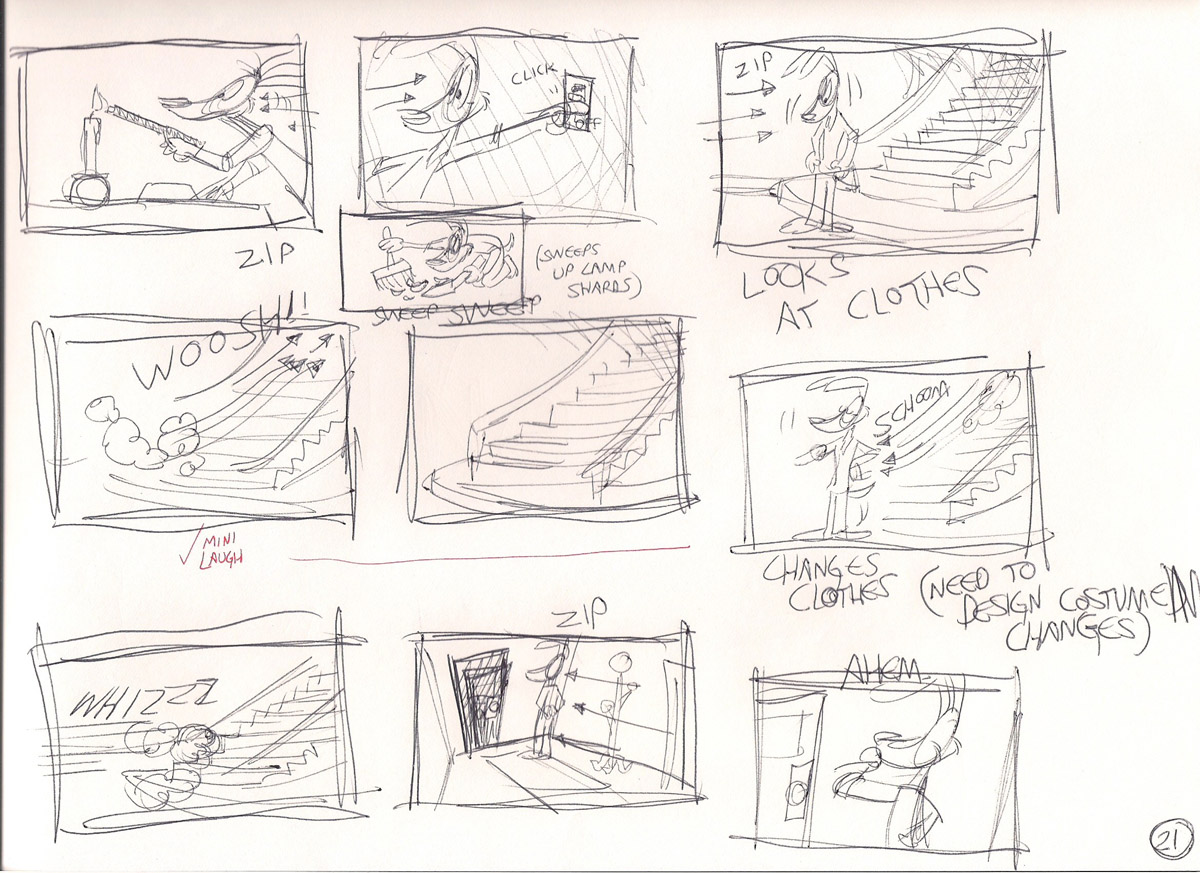
Here's the next batch of 1st-draft storyboard scans! You'll notice my notes -- I marked gags that got a laugh when I presented in class.

My next post will be the storyboard pages I made since last class.

(The orange notes are all the suggestions I received in class.)